The Rotman Identity
The Rotman brand identity was originally designed in 1998 by well-known Canadian graphic designer, Bruce Mau, and was modelled to look and feel like a leading edge think tank. The identity reflected Rotman's relentless focus on great research and contributing meaningfully to contemporary management practice. After a significant brand strategy review starting in 2016, Rotman has refined its identity building on the original design approach and thinking. Over the past 20 years the School has evolved to be a catalyst for positive social and economic change. We are engaged on the most pressing issues of the day, providing insights that cut through the noise of contemporary life, while offering deeper learning experiences for our students and leveraging our location at the historic campus of the University of Toronto, in the heart of a global city, in a diverse and dynamic country.
Our new tagline- here's where it changes- sums up our promise to the world!
How we express ourselves must reflect this aspiration.
The Rotman Logo (The Official Crest)

The Rotman Crest (Logo) is a fixed and locked configuration of the School Name, University Name, and University Crest. The full School Name is set in Centaur Bold upper- and lowercase to convey a sense of tradition. The arrangement of the text and the scale and positioning of the crest must not be altered. The Rotman Crest (Logo) can be used alone or in conjunction with the wordmark. The Rotman logo must never be disassembled, condensed, stretched, slanted, outlined, or otherwise distorted. It may appear only in black or white on top of any of the Rotman colours or on top of photographs where the crest is clearly visible.
RULE OF THUMB - If you use the Rotman logo for promotional or merchandising purposes, email Pym Buitenhuis for approval.
The Rotman Wordmark

The “Rotman” name has been rendered in custom-styled letterforms for impact and legibility. Always ensure that the wordmark is clearly legible, as it is the primary element of the Rotman Identity. The Rotman Wordmark must not be condensed, stretched, slanted, outlined, or otherwise distorted. It may appear in any of the colours outlined in the Rotman Colour Palettes. It may be reversed out of colour fields or photographs provided it is clearly legible.
RULE OF THUMB - If you use the Rotman Wordmark for promotional or merchandising purposes, email Pym Buitenhuis for approval.
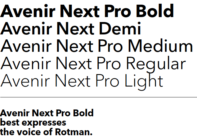
Primary and Secondary Fonts
Avenir Next Pro is the typeface for all nondigital communications from Rotman. Avenir was designed by Adrian Frutiger in 1988. The name Avenir is French for future, and takes inspiration from the typeface Futura, designed by Paul Renner in 1927. Futura was the original typeface used for Rotman communications. Avenir was designed to be a more organic, humanist, and highly legible interpretation of Futura. In 2004, Frutiger, with Akira Kobayashi, Linotype’s in-house font designer, reworked and expanded the Avenir family and created Avenir Next Pro which includes small caps, true italics, old style figures, subscripts, superscripts, and ligatures. Avenir Next Pro works across the range of print and digital applications.
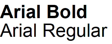
For Internal Communications, Arial is a cross-platform system typeface resident on most computers and is the typeface that should be used on letterhead, mailing labels, PowerPoint presentations and all internal Rotman documents and communications.
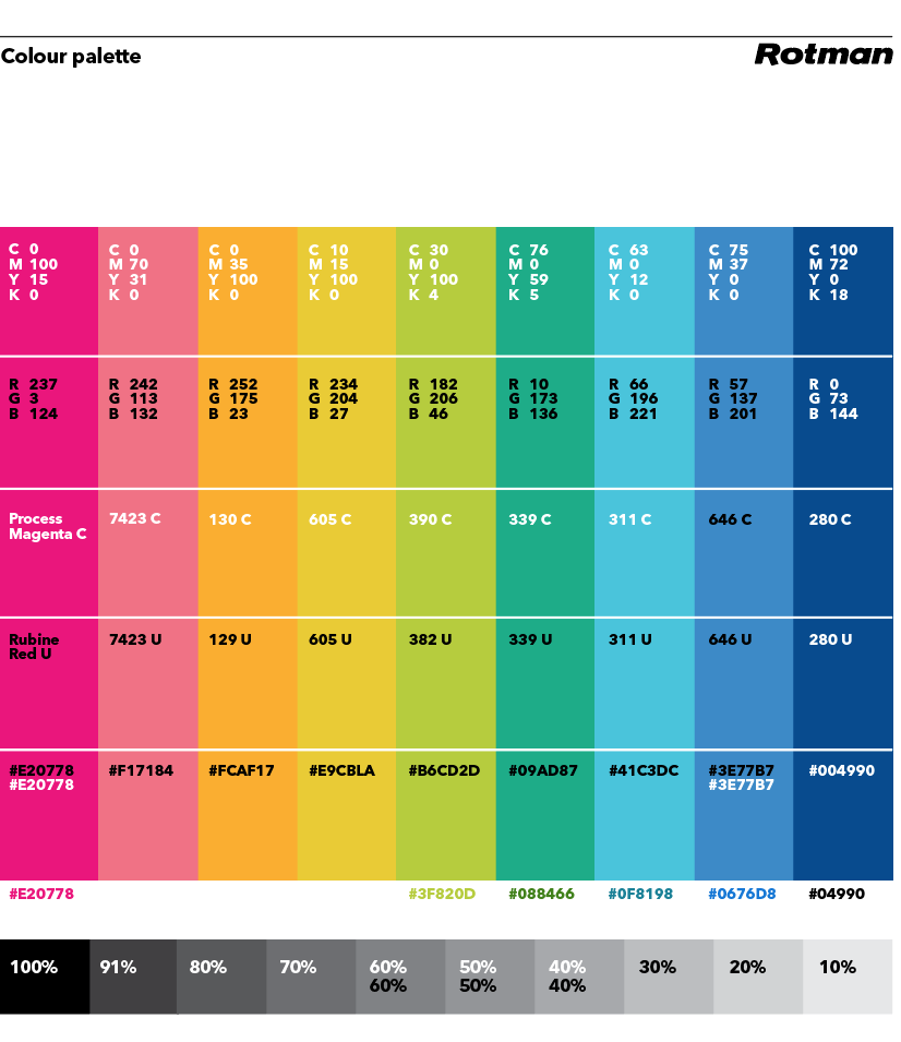
Rotman Colour Palette
The identity uses a palette of nine colours plus black plus white. The palette expresses Rotman as a catalyst and the interplay of ideas and points of view that sparks new ways of approaching problems.
There must be clarity within this broad palette and it is imperative to use only one accent colour at a time with black and white. Things could get chaotic and muddy without discipline.
Keep colour usage simple and bold. Use only one accent colour at a time. Go for large areas of flat colour.
Typography and colour
- In most cases type should be either black or white.
- Colour type is on white or black only.
- Never use colour type on a background colour.
- 91% Black 91% black is used where a dark neutral is required, such as the dark grey boxes and the footer on the website.
Accent colours: tints and tones
Tints and tones of accent colours are only to be used for charts and graphs. Neutral grey Shades of grey (increments of black) are used for type, as well as charts and graphs. Neutral grey may also be used as background tone where appropriate, such as website callouts and sidebars.